Lying factor in figures
Published:
What is the lying factor in figures?
It is the ratio between the difference of two numbers and the difference of the visualization of those two numbers. For instance:
You have two groups, each group is represented by 4 and 2. The difference between 4 and 2 is 2. Since “a picture is worth a thousand words”, someone decides to represents those groups in a figure (yes, in excel to make it worst):
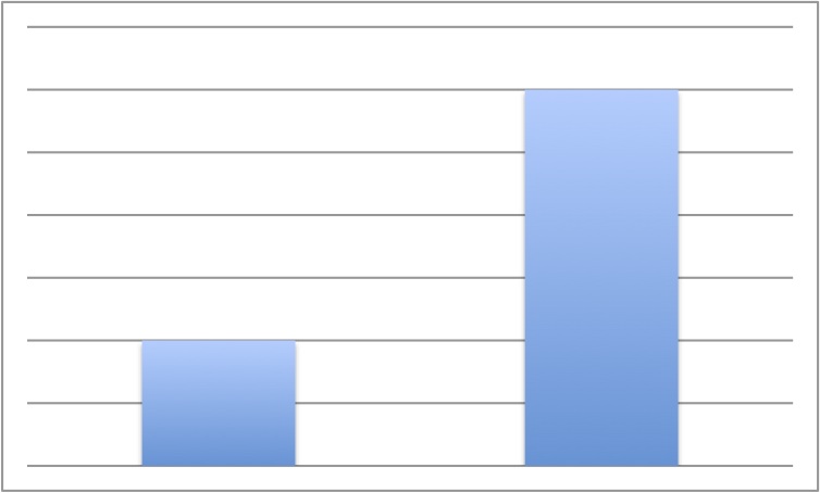
That figure shows a difference of 4 between the two groups. Since 4 is twice than 2, we have a lying factor of 2.
Probably you think that this is not happening anywhere, it is ridiculous. It is, but probably you will find one of these cases in the news every day.
Moreover, this is happening in science as well. For instance a (Nature) paper which explains how authors are improving a method that analyzes NGS data.
They visualised a matrix correlation of the data using one method or another (b or c).
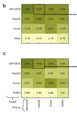
If you only read colours, you won’t see much difference, but there is. The problem was to use a different colour scale to show the same type of data. Probably they were produced separately, so the command to produce those figures (probably an R function) had to guess the scale by its own, resulting that 0.89 is equal to 0.75 .
I leave my post here, and may say: take some time to think about it.
source:http://dx.doi.org/10.1038/nbt.2596