small RNA abundance [miss-] viz
Published:
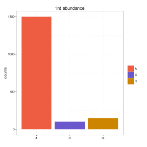
My PhD was focused on small RNA sequencing data. I had a problem when I wanted to visualized the amount of small RNAs from the beginning. Here the problem, assume that you have a certain distribution of small RNA sequences abundance:
seq1: 1500 times
seq2: 3 times
seq3: 2 times
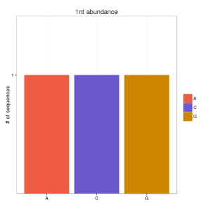
And you want to show the nucleotide composition of the first nucleotide. You can do it either counting the # of sequences (or abundance) in your set (1505) or the number of unique (different) sequences (3). You result will be very bias depending on that. If you go for the first option, you can obtain:
and if you go for the second option:
Which is the best option? well, although papers in small RNA data still continue showing the first option, I think that this should be validated some way.
When using unique sequences (only counting different sequences), you can under-estimated the real signal. In NGS, you can have a lot of noise, that may hide the biological signal using this approach. But, you can get the same, if you use directly the abundance, because if your set contains one sequence that is 90% of the data, you will get always a signal, that may be not important, for instance, ribosomal RNA that is expected to be there.
One solution is to plot the data according both values: percentage of abundance and percentage of unique sequences. And you can do this for each position and nucleotide.
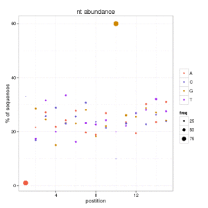
We can conclude that at position 1, there are few sequences starting with A that are 90 of the data. Also we can see how the 60% of unique sequences have a G at position 10. This helps us to catch any biological signature if it exists, and avoid the misleading information in this kind of figures.