What the Cancer Data Isn't Telling You
You’ve probably seen the headline: colorectal cancer is now the leading cause of cancer death in younger adults.
The charts are straightforward. Bars lined up. Colon cancer on top, breast cancer close behind. Same gray bars, similar heights.
But here’s what those charts don’t show: who is dying.
The Data Hidden in Plain Sight
Here’s the original chart from the American Cancer Society data, as reported by the WSJ:

When I broke down that same data by sex, the story shifted completely.
Colon and rectal cancer: ~2,200 deaths in people under 50
- Males: ~1,200
- Females: ~1,000
Breast cancer: ~3,600 deaths in people under 50
- Females: ~3,600
- Males: negligible
Same total number. Completely different story.
The Revelation
Here’s what the data looks like when you ask one more question:
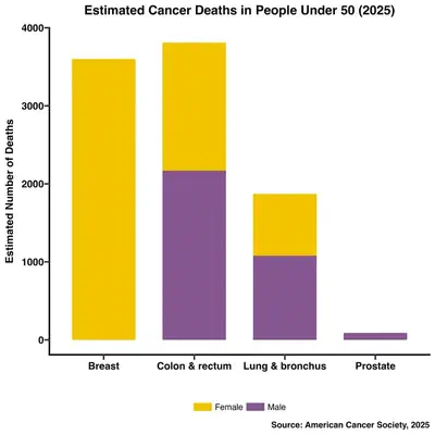
See the difference? Breast cancer (yellow bars) is almost entirely female. Colon cancer (purple and yellow combined) affects both sexes.
What This Actually Means
Women represent 50% of the population.
But we account for nearly 100% of breast cancer deaths—numbers that rival a cancer affecting everyone equally.
Colon cancer? It’s distributed across sexes. Different disease, different pattern, same raw total.
That’s not just a statistic. That’s a demographic reality that raw numbers completely obscure.
The Lesson
Data always has more layers. The question is whether you’re asking for them.
That gray bar chart wasn’t wrong. It just wasn’t complete. It answered one question: How many people are dying?
But it didn’t answer the one that matters: Who is dying, and why?
Next time you see a health statistic, ask yourself: What would this look like if I broke it down further? Who’s in this number? Who’s missing?
Data is only as honest as the questions you ask it.
Sources
- American Cancer Society - Cancer Statistics Center (2025 estimates)
- WSJ - “Colorectal Cancer Is Now the Top Cause of Cancer Death in Younger People” (January 2025)