smart PCA from count matrix data
degPCA.Rdnice plot using ggplot2 from prcomp function
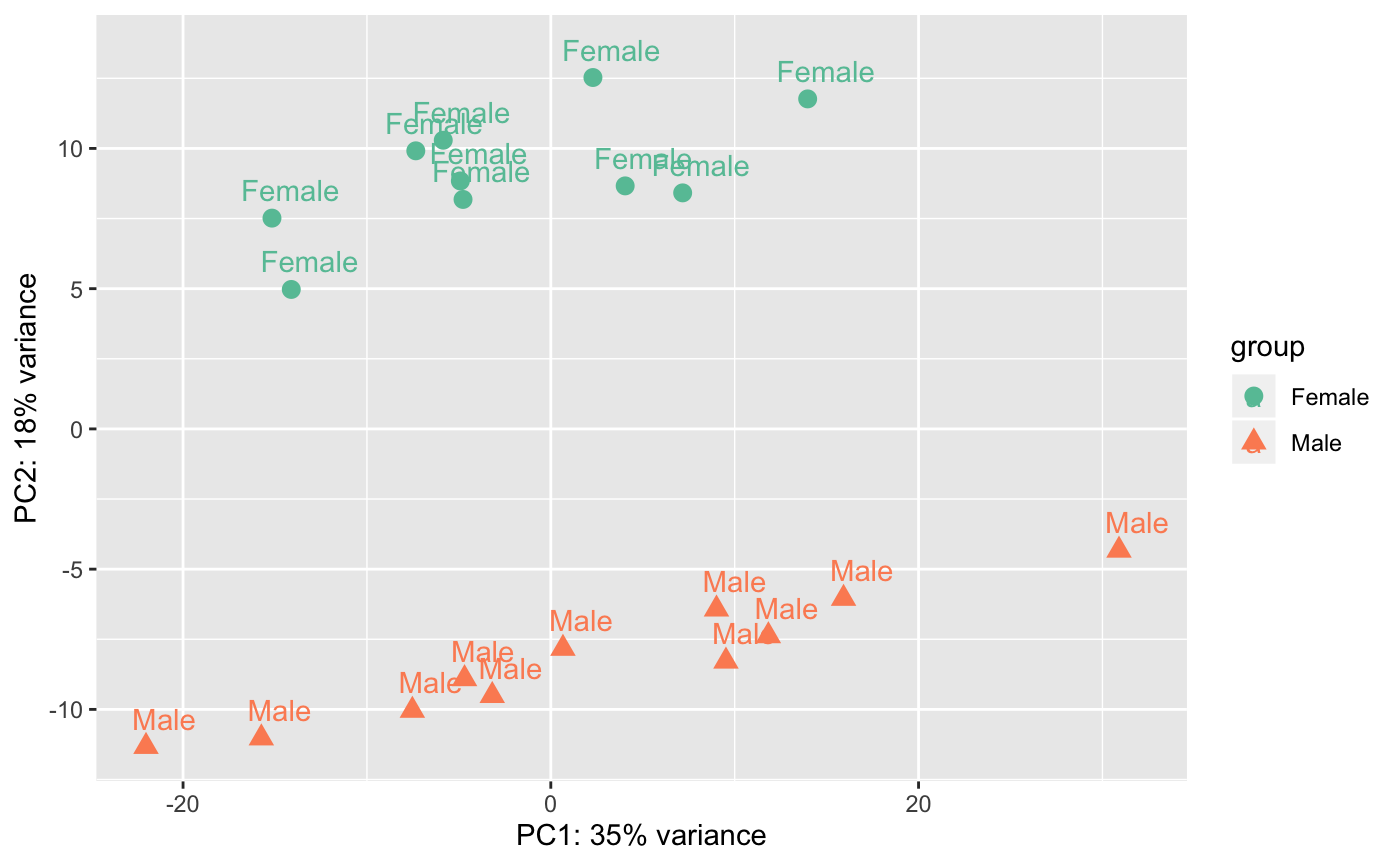
degPCA(counts, metadata = NULL, condition = NULL, pc1 = "PC1",
  pc2 = "PC2", name = NULL, shape = NULL, data = FALSE)
Arguments
| counts | matrix with count data |
|---|---|
| metadata | dara.frame with sample information |
| condition | character column in metadata to use to color samples |
| pc1 | character PC to plot on x-axis |
| pc2 | character PC to plot on y-axis |
| name | character if given, column in metadata to print label |
| shape | character if given, column in metadata to shape points |
| data | Whether return PCA data or just plot the PCA. |
Value
if results <- used, the function return the output
of prcomp().
Examples
data(humanGender)
library(DESeq2)
idx <- c(1:10, 75:85)
dse <- DESeqDataSetFromMatrix(assays(humanGender)[[1]][1:1000, idx],
colData(humanGender)[idx,], design=~group)
degPCA(log2(counts(dse)+0.5), colData(dse),
  condition="group", name="group", shape="group")