Visualizing science is also cool @polychart
Published:
One of my interest in science is finding new ways to visualize Big Data. Scientist are used to work with static visualization, that of course, is wonderful in the majority of the case. But it wouldn’t be better dynamic visualization for exploration? Play with your data, explore, and finally when you get that great figure that tell you everything you was looking for, you can export it to an image portable format.
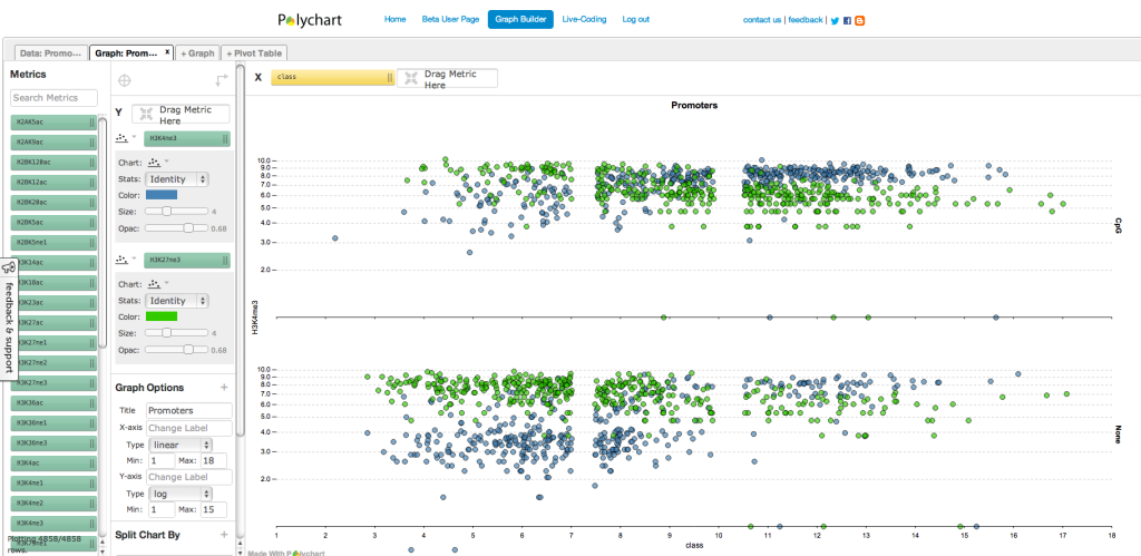
I played many time with javascript/HTML5 resources, but are no so easy to implement if you are not an expert, and some times, huge data makes difficult the easy interaction. Well, recently I found Polychart, is still in beta version, but I am using one of the feature they provide: Graph builder. And this is how it looks like after loading a file with 5000 rows and 37 columns:
 You can make different type of charts, like boxplot, barplot, piechart (although aren’t well considered) etc. Also, you can customize titles and transform data. Quick complete for a beta version.
Finally but not less important, it is free for academics. :)