What Your Running Watch Isn't Telling You About Cadence
Those color zones are comparing you to everyone else—not telling you what’s right for your body.
I finished another easy run and checked my Garmin. Orange zone. Again.
My cadence sat around 157 steps per minute. The color warned me something was off. Too slow. Below average. Less experienced.
But I felt fine. No pain. Sustainable pace with moderate effort. So what was the problem?
I dug into Garmin’s manual to find out. I discovered that, again, I was missing a lot of context to understand this metric.
The Colors Are Percentile Rankings
Here’s what Garmin’s cadence zones actually mean:
- Purple (>183 spm): Top 5% of all Garmin users
- Blue (174-183 spm): 70th-95th percentile
- Green (164-173 spm): 30th-69th percentile (“average”)
- Orange (153-163 spm): 5th-29th percentile (“less experienced or slower”)
- Red (<153 spm): Bottom 5%
My orange zone meant I ranked in the 5th-29th percentile compared to other Garmin users.
Not that my cadence was wrong for my body. Not that I was injured or inefficient. Just that most other Garmin users run with higher cadence.
These aren’t personalized to your body. They’re fixed thresholds based on population data. The same thresholds apply whether you’re 5'4" or 6'4", running easy or racing, experienced or brand new.
The zones compare you to everyone else. They don’t tell you what’s optimal for you.
What Research Actually Shows
I kept digging. Here’s what the research says about cadence:
Half of Cadence Is Just You
Researchers modeled cadence using leg length, running speed, weight, age, and running experience in 138 youth long-distance runners. These factors explained only 48-55% of the variation between runners (Taylor-Haas et al., 2022, Gait & Posture).
The other ~50%? Unmeasurable individual factors unique to each person—likely including tendon stiffness, muscle fiber length, and muscle group strength patterns that can’t be easily measured.
Elite ultramarathon runners show this clearly. A 2019 study of the top finishers at a 100-km World Championship found cadences ranging from 155 to 203 steps per minute—an average of 182 spm (Burns et al., 2019, Journal of Applied Physiology).
Same performance level. 48-step difference in cadence.
Height and Leg Length Matter
The same study found that leg length and running speed together explained approximately 50% of cadence variance (Taylor-Haas et al., 2022). Shorter leg lengths and faster running speeds were both associated with higher cadence.
The numbers:
- Every inch of height = ~3 fewer steps per minute
- A 6-foot runner naturally takes ~18 fewer steps per minute than a 5'6" runner
- Longer legs = lower leg stiffness = naturally lower cadence
Researchers even created a formula: Cadence = -1.251 × Leg Length (cm) + 3.665 × Speed (m/s) + 254.858
Calculate your expected cadence:
Remember, about 50% of cadence variance comes from leg length and running speed. The rest is individual. And this formula comes from one paper and is a guide to help you understand how different factors can affect cadence.
Speed Changes Your Cadence
Your cadence at easy pace differs from your cadence at tempo pace. Obviously.
A 2025 study of 30 experienced recreational runners (running 24+ km/week) examined how cadence changed with running speed. The study confirmed that increasing speed directly increases cadence (Leacox et al., 2025, International Journal of Sports Physical Therapy).
Same runners. Different paces. Different cadences. But there were some exceptions where runners did not increase cadence after a certain point, even as speed increased.
Garmin’s zones don’t distinguish between easy runs and hard efforts. An orange zone on an easy day doesn’t mean the same thing as orange on a tempo run.
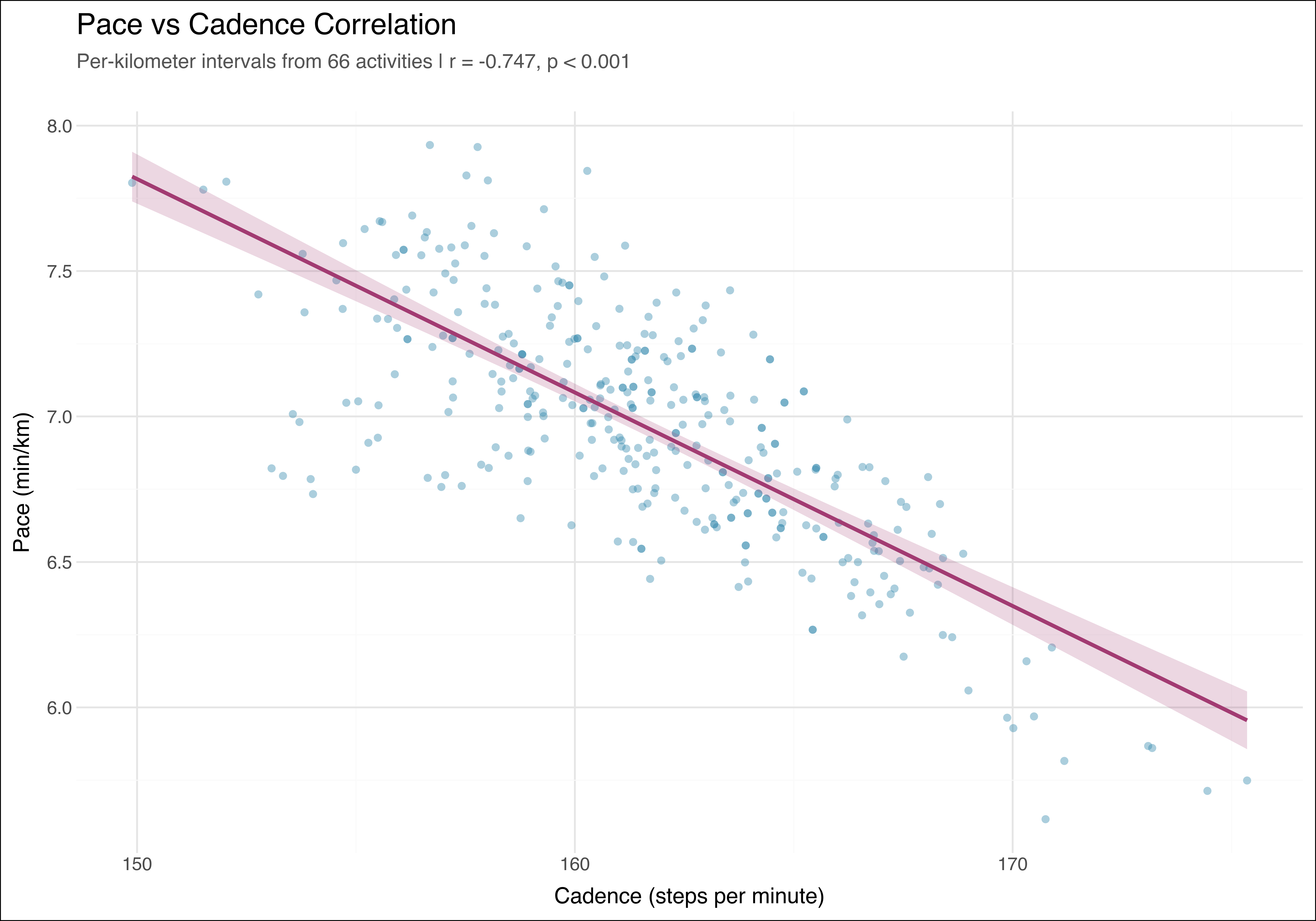
Here’s my association between cadence and speed. The correlation is clear, though there’s still variability at the same cadence. I ran in different terrains, different shoes, while sick, and while feeling fine.
The 180 Myth Lives On
You’ve probably heard it: 180 steps per minute is the “ideal” cadence.
Garmin’s purple zone starts at 183 spm, and mentions it in the explanatory text of the graph as an ideal target.
I won’t dive into the full story of where 180 came from—that would take us down a rabbit hole of observations, elite athletes, and how one number became running gospel. But here’s what matters: research shows it doesn’t apply to everyone.
Elite ultramarathoners performing at the same level run with cadences ranging from 155 to 203 steps per minute (Burns et al., 2019). That’s a 48-step difference. Same performance. Wildly different cadences.
The 180 rule came from watching elite runners at race pace. Not recreational runners. Not easy pace. Not different body types.
Yet somehow it became the standard everyone chases.
What This Means for You
Ignore the colors.
Orange doesn’t mean you’re doing something wrong. Especially if you’re tall, running easy pace, or simply built differently from the average Garmin user.
The colors rank you against a population. They don’t assess your optimal cadence.
For me, here’s a simple decision rule: If I am in orange or green and feel good, I am fine.
Focus on what actually matters:
-
Accept that pace changes cadence: Your easy runs will have different cadence than your hard efforts. That’s normal, not a problem.
-
Understand the limitations: Percentile rankings tell you where you fall in a distribution. They don’t tell you what’s right for you.
The Data Literacy Lesson
Your running watch gives you data. Lots of it. But understanding what that data actually measures—versus what you think it measures—makes the difference between useful information and unnecessary anxiety.
Color zones are percentile rankings. They compare you to other runners. They don’t optimize for your body.
This is how bad data interpretation happens. Not from wrong numbers, but from misunderstanding what the numbers mean.
An easy solution would be to use better color theme. The problem is they’re choosing colors that trigger warning/danger emotions when the messaging isn’t about that. That, and adding a better explanation on the info page. It’s misleading as it stands.
Next time you see orange, remember: that color tells you where you rank compared to other Garmin users. It doesn’t tell you your cadence is wrong.
Your body’s data matters more than population averages. Trust how you feel. Watch for actual problems (pain, injury, very low cadence). And don’t let a percentile comparison convince you that your body is wrong.
Scientific References
Primary Research Papers
Taylor-Haas, J. A., Garcia, M. C., Rauh, M. J., Peel, S., Paterno, M. V., Bazett-Jones, D. M., Ford, K. R., & Long, J. T. (2022). Cadence in youth long-distance runners is predicted by leg length and running speed. Gait & Posture, 98, 266-270. DOI: 10.1016/j.gaitpost.2022.09.085
Burns, G. T., Zendler, J. D., & Zernicke, R. F. (2019). Step frequency patterns of elite ultramarathon runners during a 100-km road race. Journal of Applied Physiology, 126(2), 462-468. DOI: 10.1152/japplphysiol.00374.2018
Leacox, A., Fashingbauer, L., Ferguson, T., Zajakowski, A., Baum, B., & Reinking, M. (2025). The Effect of Running Speed on Cadence and Running Kinetics. International Journal of Sports Physical Therapy, 20(7), 957-963. DOI: 10.26603/001c.140544
Technical Documentation
Garmin Ltd. Forerunner 245/245 Music Owner’s Manual - Color Gauges and Running Dynamics Data. Retrieved from https://www8.garmin.com/manuals/webhelp/forerunner245/EN-US/GUID-EE9E7F6F-49BE-4452-82E6-B40371D0AEC1.html
Garmin Ltd. fēnix 7 Series Owner’s Manual - Color Gauges and Running Dynamics Data. Retrieved from https://www8.garmin.com/manuals/webhelp/GUID-C001C335-A8EC-4A41-AB0E-BAC434259F92/EN-US/GUID-EE9E7F6F-49BE-4452-82E6-B40371D0AEC1.html